Home
Home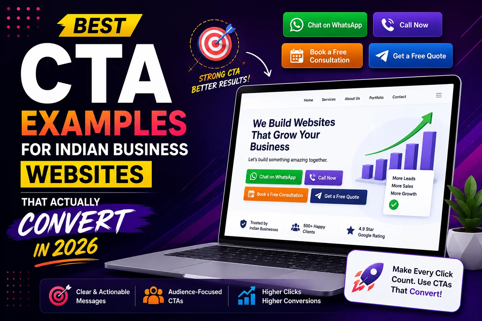
Your call-to-action (CTA) is the single most important element on any web page.
It is the moment you ask a visitor to take action — and most Indian business websites
waste this moment with weak, generic CTAs that convert almost no one.
“Submit.” “Click Here.” “Contact Us.” “Learn More.”
These CTAs communicate nothing, create no urgency, and give visitors no reason to act now.
This guide gives you proven CTA examples specifically designed for Indian business websites —
with explanations of why each one works and how to adapt them for your business.
What Makes a CTA Convert for Indian Audiences?
Indian customers respond to CTAs differently than Western audiences.
Understanding these specific preferences dramatically improves your conversion rate.
- WhatsApp preference: Indian customers trust WhatsApp — CTAs that open WhatsApp convert significantly better than email forms
- Free offer appeal: “Free quote”, “free consultation”, “free audit” — Indian buyers respond strongly to free value before commitment
- Specific response time: “Reply within 2 hours” removes uncertainty and increases trust
- Local language cues: Mixing Hindi or Gujarati words in CTAs can increase relatability for local audiences
- No risk framing: “No obligation”, “no advance payment”, “cancel anytime” reduce purchase anxiety
- Urgency that feels genuine: Real deadlines, limited slots, or seasonal offers — not manufactured fake scarcity
Primary CTA Examples — Hero Section
Your hero section CTA is the most important on your entire website — it appears above the fold
and is the first action opportunity every visitor sees.
For Web Designers and WordPress Developers
- “Get Your Free Website Quote — Reply in 2 Hours”
- “WhatsApp Us for a Free Website Consultation”
- “Start Your Website Project — Free Strategy Call”
- “Get a Custom Quote for Your Surat Business Website”
- “See Our Work → Then Let’s Talk About Yours”
For eCommerce Businesses
- “Shop Now — Free Delivery Above ₹999”
- “Get 20% Off Your First Order — Use Code WELCOME”
- “Order on WhatsApp — Fastest Delivery in Surat”
For Service Businesses (Doctors, CA, Lawyers)
- “Book a Free 15-Minute Consultation”
- “WhatsApp for Appointment — Available Today”
- “Get Expert Advice — First Consultation Free”
For B2B Businesses
- “Request a Sample — Free for Surat Businesses”
- “Get Bulk Pricing — Reply Within 4 Hours”
- “Download Our Product Catalogue — Free”
Secondary CTA Examples — Supporting Actions
Every page should have a primary CTA and a secondary CTA for visitors not yet ready to commit.
The secondary CTA captures visitors who need more information before deciding.
- Primary: “Get a Free Quote” → Secondary: “See Our Portfolio First”
- Primary: “WhatsApp Us Now” → Secondary: “Read Client Testimonials”
- Primary: “Book a Consultation” → Secondary: “View Our Pricing”
- Primary: “Start Your Project” → Secondary: “Download Our Process Guide”
- Primary: “Get Free Audit” → Secondary: “Learn How It Works”
WhatsApp CTA Examples — Highest Converting for India
WhatsApp CTAs consistently outperform contact forms for Indian audiences.
The pre-filled message is critical — make it as easy as one tap to start the conversation.
- “💬 WhatsApp Us for a Free Quote” → Pre-filled: “Hi, I need a quote for my website project”
- “Chat on WhatsApp — We’re Online Now” → Pre-filled: “Hi Tejas, I want to discuss my website”
- “Get Instant Reply on WhatsApp” → Pre-filled: “Hi, I found your website and want to know more”
- “WhatsApp for Same-Day Response” → Pre-filled: “Hello, I’m interested in your web design services”
- “Message Us on WhatsApp — Free Advice” → Pre-filled: “Hi, I have a question about my website”
Blog Post CTA Examples
Every blog post needs a CTA — both mid-post and at the end.
Blog CTAs should connect the post topic directly to your service.
Mid-Post CTAs (After First 3 to 4 Sections)
- “Need help implementing these tips? WhatsApp us — free consultation”
- “Is your website making these mistakes? Get a free audit today”
- “Want these results for your Surat business? Let’s talk”
End-of-Post CTAs
- “Ready to improve your WordPress website? Get a free audit — [WhatsApp Button]”
- “Want a website that generates real leads in Surat? Get a free quote today — [Button]”
- “Implementing this yourself? Need help? We offer a free 30-minute strategy call — [Button]”
Service Page CTA Examples
Service pages need CTAs at the top, middle, and bottom of the page.
Each CTA placement serves a different visitor behavior.
Top of Service Page (Above Fold)
- “Get a Free WordPress Development Quote — Starting from ₹20,000”
- “Free Consultation for Your Website Project — Reply Within 2 Hours”
Middle of Service Page (After Benefits Section)
- “Ready to Start? WhatsApp Us for Your Custom Quote”
- “See How We’ve Helped 50+ Surat Businesses — View Portfolio”
Bottom of Service Page (After FAQ)
- “Still Have Questions? We’ll Answer Everything on WhatsApp — Free”
- “Book Your Free Consultation — No Obligation, No Sales Pressure”
Urgency and Scarcity CTA Examples for Indian Businesses
Genuine urgency increases conversion rates — but only when the scarcity is real.
Never use fake countdown timers or manufactured scarcity — Indian customers recognize and distrust it.
- “Only 3 Website Slots Available in July — Book Your Project Now”
- “Diwali Special: 15% Off All New Website Projects — Offer Ends October 31”
- “New Year Offer: Free SEO Setup Worth ₹5,000 — January Projects Only”
- “Limited: Taking Only 5 New Clients This Quarter — Check Availability”
CTA Button Design Best Practices for Indian Websites
- Color: High-contrast button — orange (#FF6B35) or green (#25D366 for WhatsApp) on white background performs well for Indian audiences
- Size: Minimum 48px height on mobile — large enough to tap accurately with thumb
- Text: Action verb first — “Get”, “Start”, “Book”, “WhatsApp”, “Download” — not “Submit”
- Spacing: Adequate white space around button — never crowded by other elements
- Position: Above fold on every key page — never require scrolling to find the primary CTA
- Mobile: Full-width button on mobile — easier to tap than narrow button
- Icon: WhatsApp icon on WhatsApp CTAs — immediately recognizable to Indian users
CTA Mistakes Indian Business Websites Make
- “Submit” button text — provides no information about what happens next
- Grey or light-colored buttons that blend into the background
- CTA only at the bottom of long pages — visitors who stop scrolling miss it entirely
- Same CTA text repeated 5 times on one page — variety in phrasing performs better
- No secondary CTA for visitors not ready to commit — losing fence-sitters
- CTA linking to general homepage instead of specific relevant page
- No pre-filled WhatsApp message — visitors have to think of what to type
A/B Testing CTAs for Indian Business Websites
Small changes to CTA text can produce significant conversion improvements.
Test these variations on your most-visited pages:
- Test 1: “Get a Free Quote” vs “WhatsApp for Free Quote” — which channel converts better?
- Test 2: “Contact Us” vs “Book a Free Consultation” — does specificity improve clicks?
- Test 3: Button color — orange vs green vs blue — which gets more clicks?
- Test 4: With price vs without price — “Starting from ₹15,000” vs no price mentioned
- Test 5: Urgency vs no urgency — “Only 3 slots left” vs standard CTA
Use Google Optimize (free) or a simple A/B test by switching CTAs weekly and comparing
WhatsApp inquiry volumes to identify which version performs better for your Surat audience.
Conclusion
Your CTA is the bridge between a visitor reading your content and becoming a paying client.
The difference between “Submit” and “Get Your Free Website Quote — Reply in 2 Hours”
is the difference between a 1% conversion rate and a 5% conversion rate —
from the exact same traffic.
Start with your homepage hero CTA and your most important service page.
Implement a WhatsApp CTA with a pre-filled message today.
Add a secondary CTA for visitors not yet ready to commit.
These three changes alone will measurably improve your Indian business website’s lead generation.
Call To Action
Want professional CTA optimization and conversion design for your Indian business website?
Get a free conversion audit today — we identify exactly what is stopping visitors from contacting you.
Or contact us on WhatsApp to discuss your website conversion strategy.
Frequently Asked Questions
What is the best CTA for an Indian business website?
For most Indian businesses — a WhatsApp CTA with a pre-filled message converts best.
“WhatsApp Us for a Free Quote” with a pre-filled greeting removes all friction
and leverages India’s overwhelming preference for WhatsApp business communication.
How many CTAs should an Indian business website have per page?
Each page should have one primary CTA (main action) and one secondary CTA (softer alternative).
Long service pages should repeat the primary CTA at top, middle, and bottom.
Too many different CTAs create decision paralysis — stick to one primary action per page.
Should I use “Free” in my CTA for Indian business websites?
Yes — “free” is highly effective for Indian audiences. “Free quote”, “free consultation”,
and “free audit” consistently outperform equivalent CTAs without the word “free”.
Indian customers respond strongly to free value before any financial commitment.
What color should my CTA button be on an Indian business website?
High contrast is most important — the button must stand out clearly from the background.
Orange and green perform well for Indian audiences. WhatsApp green (#25D366) is immediately
recognized and trusted by Indian users for WhatsApp-specific CTAs.
How do I write a CTA for a WhatsApp button on my Indian business website?
Use action-first text: “WhatsApp Us Now”, “Chat on WhatsApp”, or “Get Instant Reply on WhatsApp”.
Set a pre-filled message that starts the conversation: “Hi, I’m interested in your web design services.”
This removes the friction of visitors having to think of what to type first.
How often should I test and change CTAs on my Indian business website?
Test one CTA change at a time for a minimum of 2 to 4 weeks before evaluating results.
Change CTAs seasonally for genuine offers — Diwali, New Year, summer specials.
A/B test your highest-traffic pages first — even a 2% conversion improvement on a busy page generates significant additional leads.